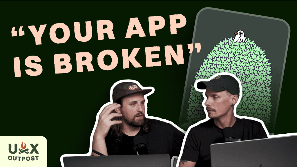
Andy tested Nolan's app and was not impressed.
TaskTree is an app Nolan made (and spoke about at Config) which started from a comment and became a bird-based gamified todo list.
The data was looking rough so Nolan ran a user test with Andy... on camera... and let's just say the app needs some work.
Watch Nolan try to not cry on the 5th episode of UX Outpost 👇
AI tells us what to design, then beats us at our own game
Key Takeaways
Test as often as you can. Nolan hadn't ran a user test on TaskTree in months and it lead to assumptions that had nothing to do with the core problems.
Track as many data points as possible. TaskTree logs how many users went through onboarding, but doesn't break down how many skipped vs completed.
User tests encited by data patterns needs to remain broad in the test. So many levers attribute to data going one way or another and you can't hypothesize until you understand them.
Onboarding cannot be an afterthought. Even in a minimal app, users do not care enough to figure out your product. Help them by slowing down around non-standard UX patterns.
Complexity is the killer of great experiences. Nolan tried to bring some new ideas, but the execution and onboarding just added confusion instead of empowering users.
Insights can drive the roadmap. Clearly defined insights are what move product-lead teams and is where designers can make a huge impact.
Nolan's Thoughts
Let me first make an excuse and say that TaskTree is a side project.
Okay, now let me be more real with you:
I had just spent weeks planning this huge rework in the gamification mechanics--like, literally was prepping the handoff files--and then I saw Andy use my baby and I wanted to puke.
So many micro interactions missed the mark, but beyond that, some of the core ideas that I had accepted as important to the product just added confusion and derailed even the simplest of tasks. My head was spinning with all the insights I got from the test and realized that the problems had very little to do with my assumption of shotty gamification mechanics.
Since this test, I've completely overhauled the way the task system works (see my Figma file) and we're in development on those changes. I'll definitely be doing more tests as we roll them out.
Here's hoping it'll be enough to turn the data positive 🤞

Andy's Thoughts
I still stand by everything I said in this episode. The app has a lot of charm, but the onboarding flow and interaction design need serious tightening.
There were too many moments where I got confused or tripped up... if that happened to me, it’s almost guaranteed other users are struggling too. Tiny tap targets, vague labels, unclear navigation… it all adds up.
The visuals are lovely, but the core experience needs to be more intuitive. Smooth, obvious micro-interactions would go a long way in helping this thing stick

Get emails like these in your inbox
No spam, ever. Unsubscribe anytime.
Rad Collab | 2024, All Rights Reserved |