Craft is spending 20 minutes on a button...
Apple's Liquid Glass is a contrast catastrophe BLAH BLAH BLAH...
The real thing to watch is that this is a soft signal toward design craft being elevated in our workflows. When a company as big as Apple makes a move, it affects every industry.
Jordan Singer is also someone pushing the boundaries of craft and his buttons are absolutely insane in detail.
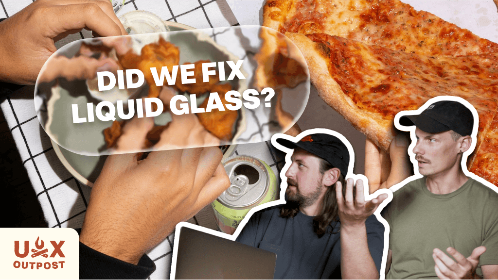
We tried to recreate it all as we talked about craft's impact on the 4th episode of UX Outpost 👇
AI tells us what to design, then beats us at our own game
Key Takeaways
Apple tried to push the limits of design and some people didn't like it. Accessibility is a key point, and one that Apple fixed in a recent update (though, you can still manage the frost level in accessibility settings)
Just last week (after filming this episode) Figma dropped the Glass effect and it is so fun to play with (Nolan made a breakdown video)
Why does this matter? This is a huge push toward "craft"
No one is trying to push craft as hard as Jordan Singer. He's making Mainframe that has incredible attention to detail.
We tried recreating his buttons and barely were able to make it happen in 10 minutes while making a direct copy.
With all this pushing the boundaries of vibe and aesthetic, maybe we're heading toward a world where we get to spend 2 hours making a button in the name of building a brandable moment??

Nolan's Thoughts
I have always considered myself a ui designer before ux designer. I love to make things that look beautiful and fun if only to hve a moment of beauty and whimsy. It's this sentiment that, as AI grows in adoption, I hope/wish will continue to grow.
When Apple makes a new design style, the entire tech industry takes notice and changes trends. I don't think Liquid Glass will do that, but I do think it's shining a light on companies who take design seriously and where they're spending their time.
I had to bring up Jodan Singer's buttons (even though I've already made a post about it before) because he's really one of those designers who are far out ahead while still being familiar enough to sell to stakeholders.
I think this is where the balance is going to be for us designers who care about vibez: make it familiar and make it fun while building a systemized branded experience in the meantime.

Andy's Thoughts
I still stand by my original take that Apple’s Liquid Glass UI was a contrast catastrophe, but it has improved with iOS 26 betas, becoming a little more readable while staying polarizing.
I documented its evolution across several TikToks, admiring its visual flair while calling out usability flaws and Apple slowly reducing transparency.
Figma’s new Glass effect solves the problem for designers by providing proper tools and an official UI kit that matches Apple’s design language. Craft is clearly making a comeback, but it highlights the tension between aesthetics, accessibility, and developer practicality in modern interfaces.

Get emails like these in your inbox
No spam, ever. Unsubscribe anytime.
Rad Collab | 2024, All Rights Reserved |